+- MacResource (https://forums.macresource.com)
+-- Forum: My Category (https://forums.macresource.com/forumdisplay.php?fid=1)
+--- Forum: 'Friendly' Political Ranting (https://forums.macresource.com/forumdisplay.php?fid=6)
+--- Thread: "Real versus Imagined Wealth Distribution in the U.S." (/showthread.php?tid=104495)
Pages:
1
2
"Real versus Imagined Wealth Distribution in the U.S." - Ted King - 10-07-2010
Heard about this on NPR this morning:
http://www.slate.com/id/2268872/
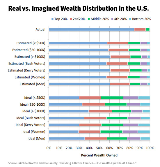
People know we're living in a time of growing income inequality, Krugman told me, but "the ordinary person is not really aware of how big it is." The ignorance hypothesis gets a strong assist from a new paper for the journal Perspectives on Psychological Science: "Building a Better America—One Wealth Quintile at a Time." The authors are Michael I. Norton, a psychologist who teaches at Harvard Business School, and Dan Ariely, a behavioral economist (and blogger) at Duke. Norton and Ariely focus on the distribution of wealth, which is even more top-heavy than the distribution of income. The richest 1 percent account for 35 percent of the nation's net worth; subtract housing, and their share rises to 43 percent. The richest 20 percent (or "top quintile" ) account for 85 percent; subtract housing and their share rises to 93 percent. But when Norton and Ariely surveyed a group whose incomes, voting patterns, and geographic distribution approximated that of the U.S. population, the respondents guessed that the top quintile accounted for only 59 percent of the nation's wealth.
In his book The Wisdom of Crowds, James Surowiecki cites example after example in which collective judgment proves remarkably accurate. When a finance professor polled his class about the number of jelly beans in a jar, individual answers were all over the map, but when he averaged them, the group estimate was less than 3 percent off. When a British statistician reviewed tickets from a contest to guess the weight of an ox at a livestock fair, he found similarly diverse answers, but when he averaged them, the group estimate (1,197 pounds) was less than 0.1 percent off. Such "crowd-sourcing," however, turns out to be a terrible method for estimating the distribution of wealth. Norton and Ariely's respondents were off by 31 percent, even though wealth distribution (unlike income distribution) has remained essentially unchanged for a generation.
Norton and Ariely broke down the responses by income group and found the guesses became slightly more accurate as you moved up the income scale. But more striking was the uniformity among income groups. All five quintiles imagined the top quintile to possess about 60 percent of the nation's wealth. (Again, the real figure is 85 percent.) More surprising still, the average guess of a respondent who'd voted for George W. Bush in the 2004 presidential election was not appreciably different from the average guess of a respondent who'd voted for John Kerry. The Kerry voters imagined the top quintile's share to be larger than the Bush voters did, but again, both figured it was about 60 percent.
Norton and Ariely also asked respondents what they thought the ideal distribution of wealth should be, and found, again, little difference among income groups, or between Bush voters and Kerry voters. Most favored a wealth distribution resembling that in … Sweden! But when you examine Norton and Ariely's method, that particular finding gets a little shaky. They showed respondents three unlabeled pie charts. One depicted utopian equality, with wealth distributed equally among five groups. The second depicted the United States, with wealth distributed very unequally among five groups (one of which gobbled up 85 percent—Norton and Ariely put it at 84 percent, but let's not quibble). The third depicted Sweden, where the top quintile accounts for 35 percent of the nation's wealth. Neither the Swedish pie chart nor the U.S. pie chart was identified by nation. Norton and Ariely were astonished that 47 percent of respondents—remember these were all Americans—chose the pie chart depicting Sweden. But surely most survey-takers, when presented with two extreme options and one that lies in the middle, will instinctively gravitate, like Goldilocks, toward the middle option. More surprising to me was that second place went to Utopia (43 percent). Only 10 percent voted for the pie chart depicting the country the respondents actually live in.
Re: "Real versus Imagined Wealth Distribution in the U.S." - Spock - 10-07-2010
Norton and Ariely were astonished that 47 percent of respondents—remember these were all Americans—chose the pie chart depicting Sweden.
They want to be ......... socialists.
or Utopian.
The amazing statistic is that only 10% voted for the status quo.
Re: "Real versus Imagined Wealth Distribution in the U.S." - Gutenberg - 10-07-2010
That was an interesting story this morning. I was surprised at the disparity between supposed income distribution and the reality. People really haven't been paying attention. Essentially, since 1984 or so, if new wealth is created it goes straight into the pockets of the wealthy. The middle class is actually shrinking--the opposite of what was happening in our parents' day.
Re: "Real versus Imagined Wealth Distribution in the U.S." - $tevie - 10-07-2010
The article also mentions that the number of people who consider themselves middle-class may be growing.
The United States may possess a shrinking middle class, but the number of its citizens who consider themselves middle class (because they can't face that they're rich) may actually be growing. Perhaps a similarly large number consider themselves middle class because they can't face that they're poor. What we can conclude with some certainty is that counting dollars belonging to oneself relative to others is a much more emotionally distorted activity than counting jelly beans.In my opinion, people do indeed have a distorted idea of how middle class is defined. If $250,000/yr is middle class, and it seems that many people consider it to be so, then I'm terribly behind the times in how I define it.
Re: "Real versus Imagined Wealth Distribution in the U.S." - $tevie - 10-07-2010
Spock wrote:
Norton and Ariely were astonished that 47 percent of respondents—remember these were all Americans—chose the pie chart depicting Sweden.
They want to be ......... socialists.
or Utopian.
The amazing statistic is that only 10% voted for the status quo.
I think this shows just how much of our economic discussions here (and elsewhere) are crippled by the fact that we are using terms we may not even understand.
Re: "Real versus Imagined Wealth Distribution in the U.S." - cbelt3 - 10-07-2010
My local NPR also had a local bit on the 'definition of Middle Class'. And how many people who were normally self-defined as 'working class' or 'blue collar' are now defining themselves as 'middle class'.
It was an interesting bit.
Re: "Real versus Imagined Wealth Distribution in the U.S." - DaveS - 10-08-2010
No argument with the numbers or the basic concepts.
But a question. The middle class is the 'engine' of this economy. We grew the economy from about 5 Trillion in 1982 to almost 13 trillion in 2005.
How come the middle class has basically a zero net worth at the end of this?
It wasn't that money didn't flow through our hands.
Re: "Real versus Imagined Wealth Distribution in the U.S." - Ted King - 10-08-2010
Money flows through all kinds of hands. Who ends up with how much in a "free" market system is not, as I have often said in this forum, automagically equal to how much a person is merited to have (I think I've demonstrated that pretty convincingly in the past). Those who have most control of the flow have tended to keep more of it for themselves - sometimes merited because they had a direct hand in actually creating the extra wealth, but much, much more often the people who control the flow of a lot of money, like probably most financiers, end up with more than they merit (as I judge by my value system).
Average wages since the mid 70's have actually decreased when adjusted for inflation:

Wage earners in the last few decades have wanted to think that they should have increased incomes just like the rich. But their wages generally were mostly staying flat after a steep falloff in the early 80's -except for a bit of a rise in the 90's that leveled off again in the by the mid 00's - so to maintain the illusion of the American Dream of getting ahead they went into debt and ended up with zero (or negative) net worth.
Re: "Real versus Imagined Wealth Distribution in the U.S." - mattkime - 10-08-2010
very interesting. which means that any gain in lifestyle is due to tech advantages and the lowering cost of goods.
Re: "Real versus Imagined Wealth Distribution in the U.S." - Ted King - 10-08-2010
mattkime wrote:
very interesting. which means that any gain in lifestyle is due to tech advantages and the lowering cost of goods.
I'm not sure who you are referring to when you say "gain in lifestyle", but it is true that there have been significant increases in productivity - wealth creation - but evidently that increased created wealth did not lead to an increase in average wages:

So who do you suppose ended up with the added income created by those productivity increases if it wasn't wage earners?