Posts: 11,006
Threads: 124
Joined: May 2025
Reputation:
0
Font size on the front looks great now - bigger for the titles and smaller for the posters, time, etc.
OK wow, the font size on this post box is, um, *very* easy to read.
From across the room.
Preview's OK, though!
Posts: 3,228
Threads: 294
Joined: Nov 2016
graylocks wrote:
ooh, this is so much better! can you tighten the line spacing?

I
strongly agree. Maybe you can combine the author, [ignore]/[PM] , and posting date into only one line.
All can be smaller fonts size, too.

Posts: 50,838
Threads: 670
Joined: Mar 2024
mrp-admin wrote:
[quote=N-OS X-tasy!]
"They" need glasses. I don't.
If it's going to be kept that big, at least provide virtual crayons with which to write posts.
I would recommend these so they dont roll off your monitor :thumbsup:
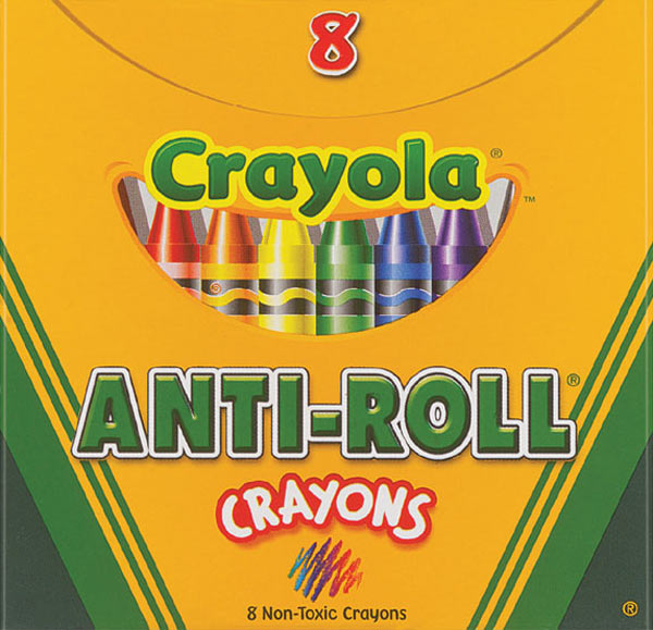
A few more colors to choose from, please.:wall:
Posts: 31,073
Threads: 1,756
Joined: May 2025
Reputation:
2
Try quitting your browser and relaunching to see if that gets rid of the green bar. It showed up a couple of times during the test, but went away. I am not seeing it on a couple of different browsers here.
Posts: 10,631
Threads: 1,154
Joined: May 2025
mrp-admin wrote:
[quote=JoeM]
I don't see anyone posting about the horrible looking green banner with the poorly clipped logo on top. Maybe this was discussed somewhere else and I'm missing it or am I the only one seeing this?
Umm, what?
I'm on Win XP SP2 with IE 7. Here's what I'm seeing:

At 1024px it's even worse looking.
Posts: 4,343
Threads: 408
Joined: Jan 2017
N-OS X-tasy! wrote:
[quote=mrp-admin]
[quote=N-OS X-tasy!]
PLEASE reduce text size in the posting box.
This is how they wanted it.
"They" need glasses. I don't.
If it's going to be kept that big, at least provide virtual crayons with which to write posts.
I'm the one of the people who suggested making the text in the message box bigger. It was about half the size of the text in the thread. Now it's double the size of the text in the thread. My suggestion was to make it the same size as the text in the threads above.


